A Soft and Moody Autumn Dinner Party Tablescape with Casa de Perrin
I’ve had the pleasure of creating event florals that share table space with an assortment of pieces from Casa de Perrin’s gorgeous collection of dish, glass and flatware. When you see “Casa de Perrin” listed as the provider of tabletop rentals on an event timeline you know it’s going to be a night to remember. So, when they reached out and asked if I’d be interested in collaborating with them for a tabletop styled shoot I gave them an immediate yes!
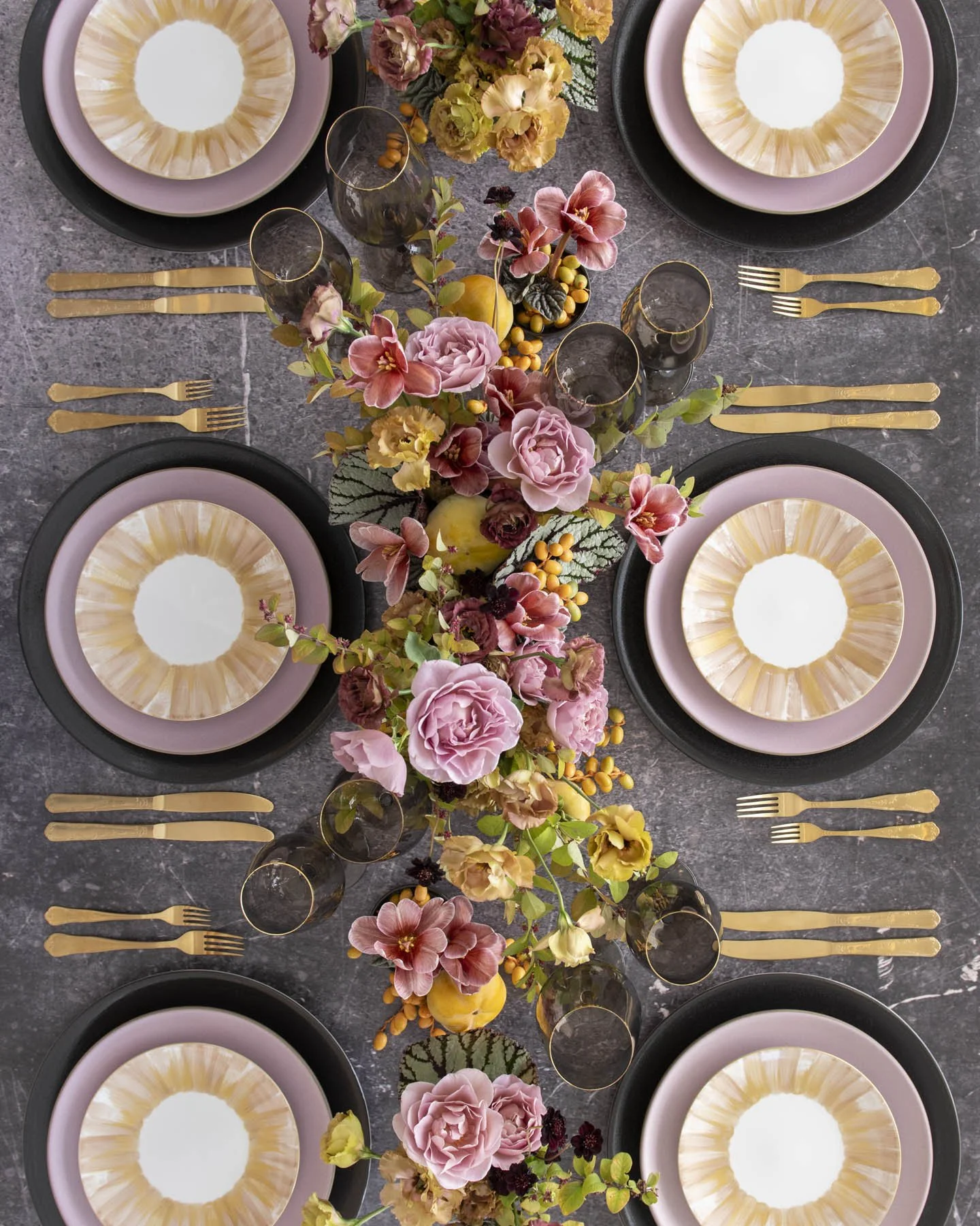
Lavender, Gold and Black for an Unexpected Autumnal Palette
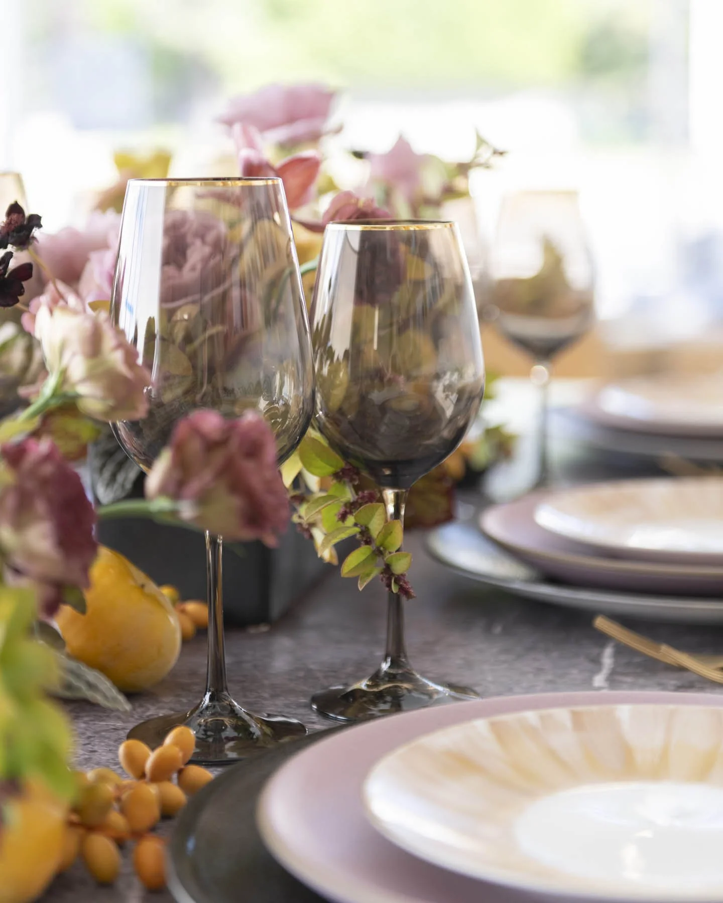
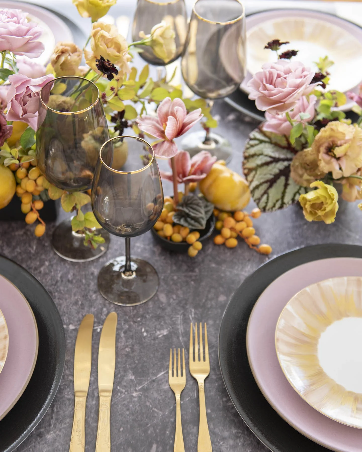
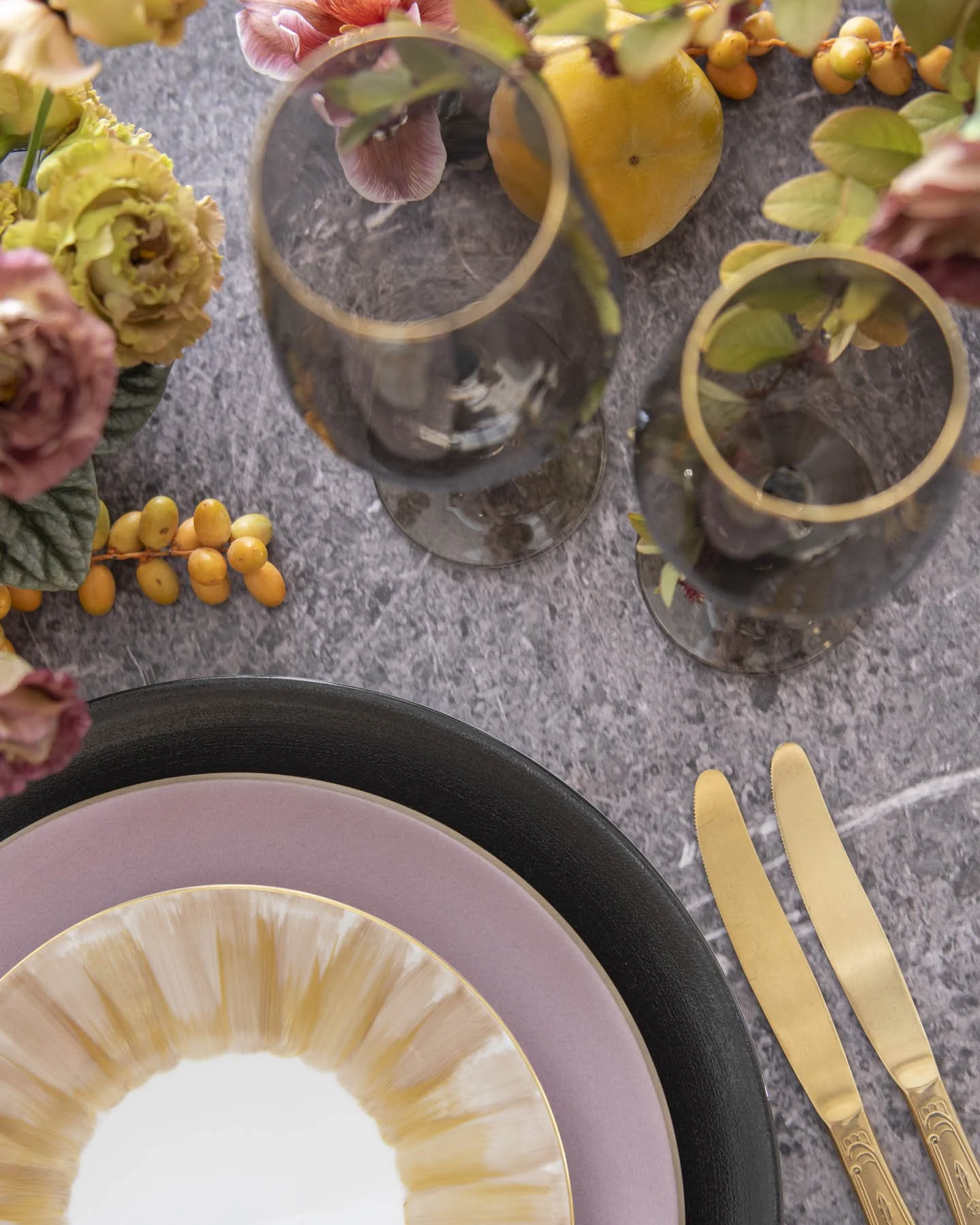
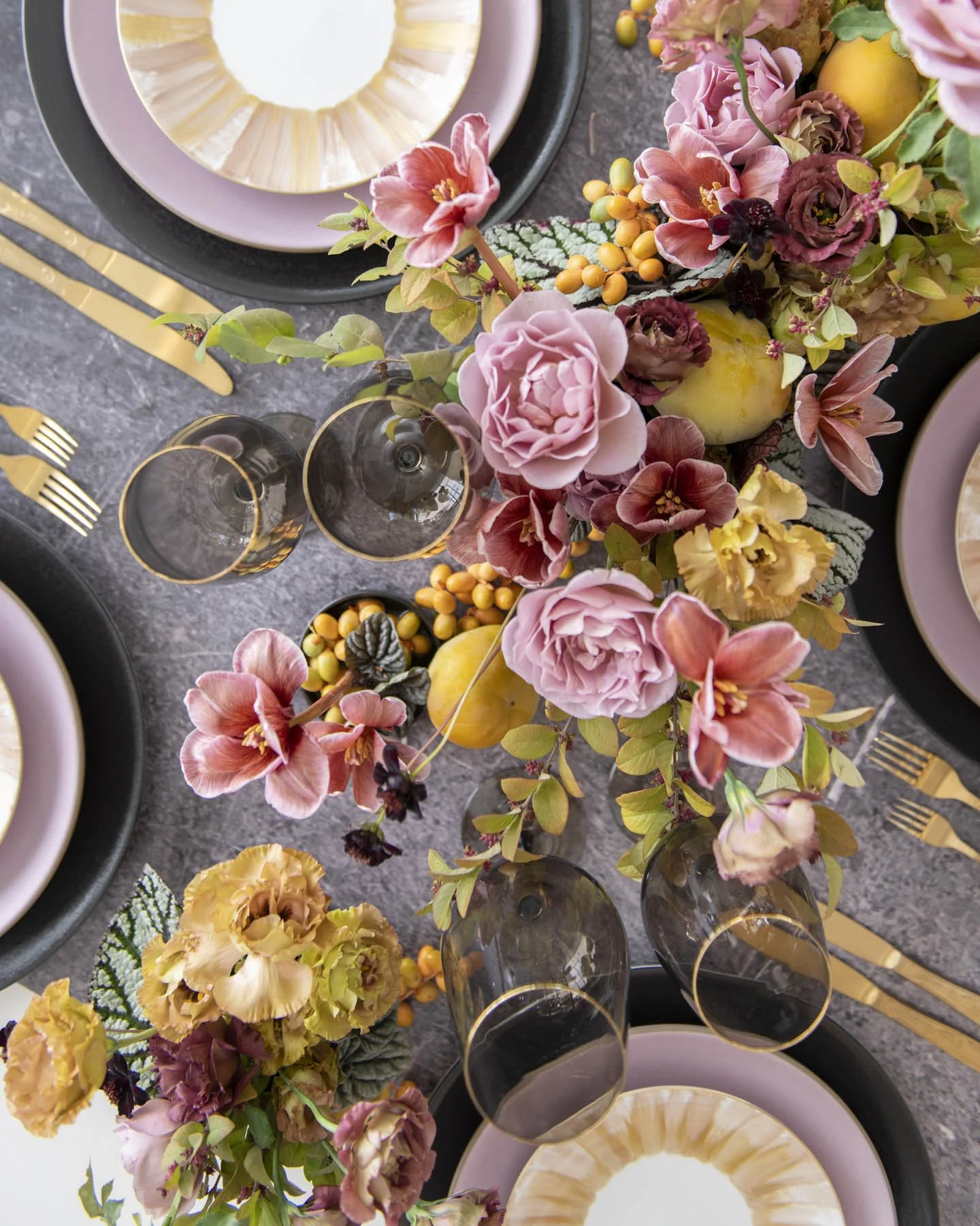
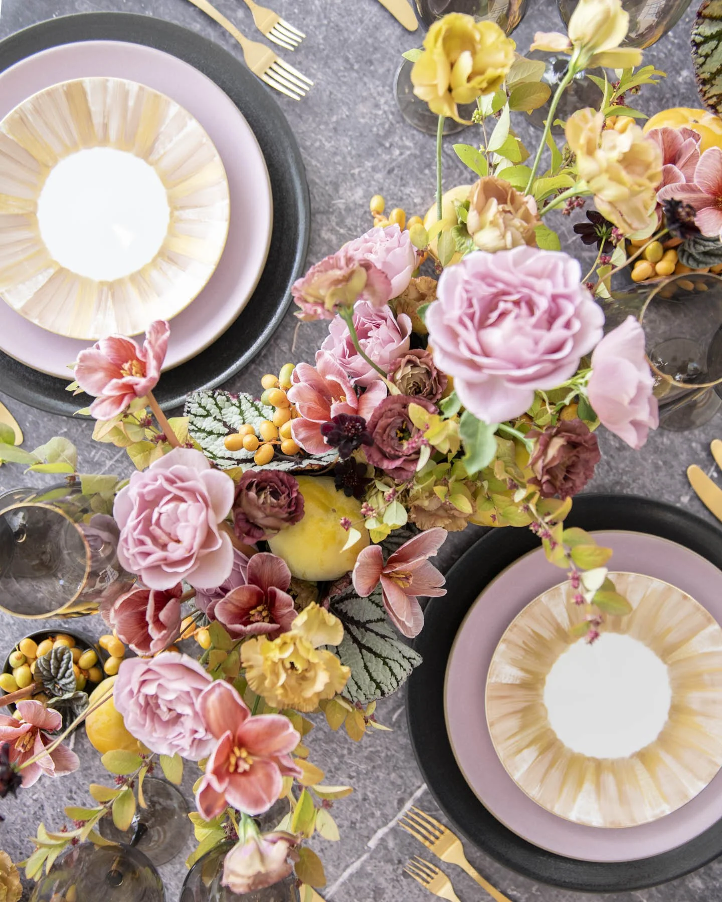
Because Casa de Perrin allowed me complete creative control, from floral styling to plate and flatware choice, I wanted to explore a palette that doesn’t immediately come to mind when one hears the word “autumn”. I was drawn to their black and muted lavender Heath Ceramic chargers and dinner plates. They are soft with a perfect matte finish and simple clean structure. I am anything but a minimalist so I needed to glam it up a bit, add a little texture and flash. As luck would have it, their gold brushed salad plates were calling my name…literally! Their “Marie” plates were the perfect contrast and complement to the simplicity of the Heath pieces. A gold rimmed, smoky glass set and vintage filigreed gold flatware topped the table setting off and set the stage for some funky, yet refined and soft, floral centerpieces.
A Collection of Dark and Light Floral Elements to Bring the Table Look Together
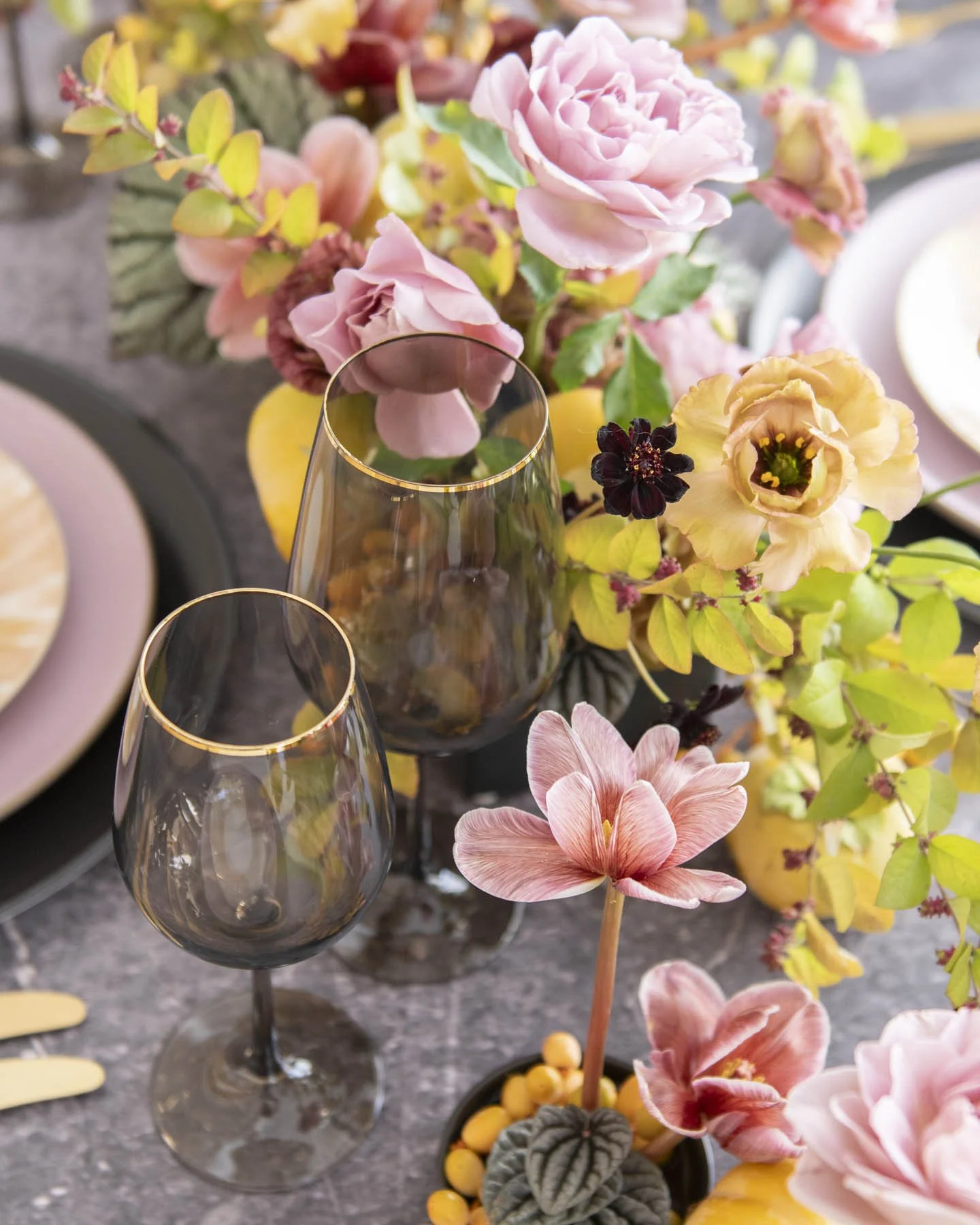
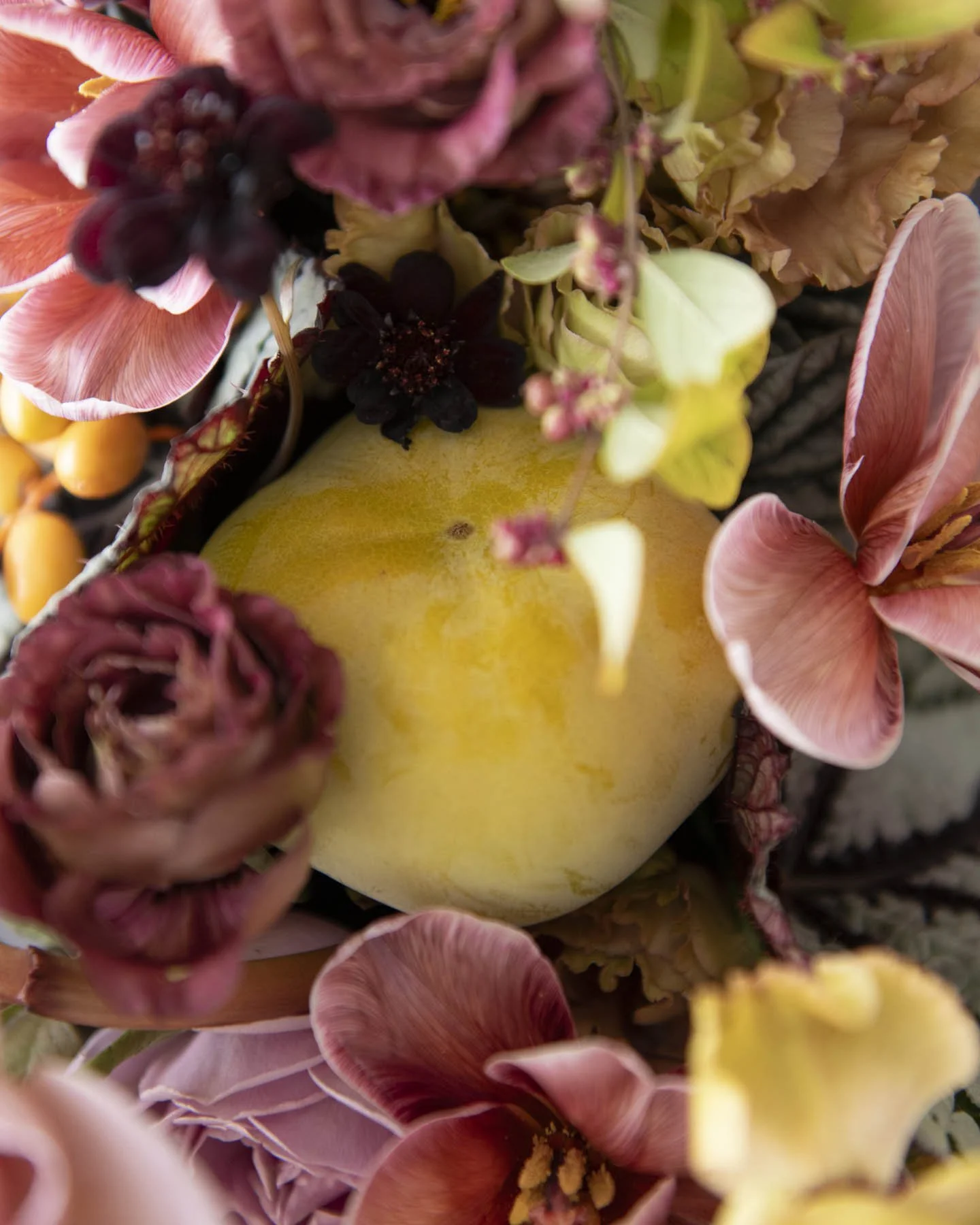
In the early weeks of autumn the Los Angeles flower market boasts some truly incredible flora. Our rose season here goes into the early weeks of November so I was particularly excited to feature some locally grown Distant Drum garden roses in my tablescape. Dappled throughout the long dining table you will find gold tipped snowberry stems with the tiniest burgundy berries nestled along their leaves. These were grown in my home state of Oregon and are a favorite of mine in October. Mauve hued Brownie tulips burst through lush clusters of deep brown and gold Lisianthus. Delicate stems of Chocolate Cosmos hover over complexly variegated begonia leaves and pops of warm honey toned palm seeds and not-yet-ripe persimmons. It is a lush bounty of color and depth.
The Key to a Standout Floral Piece is how it Explores Color
When people ask me what my favorite color is I come up blank. Sure, there are colors I lean toward but nothing that really stands out as a favorite. Instead, I prefer to love color in the context of palettes. How we see a color can be very relative and can depend greatly on what other colors are set next to it. Choosing a strong, intentional and cohesive color palette is, in my opinion, the most important part of a successful and standout floral design. Considering contrast, hue, shade, and blending tones gives me such a thrill!
I love to explore and experiment with unusual color combinations. This Casa de Perrin collaboration gave me the perfect opportunity to really dig into this contrasted and complex palette of lavender, mauve, chocolate, gold, black and honey that I had been dreaming about for ages. Give me free reign to play with any color palette I want and I will be a truly happy flower girl!